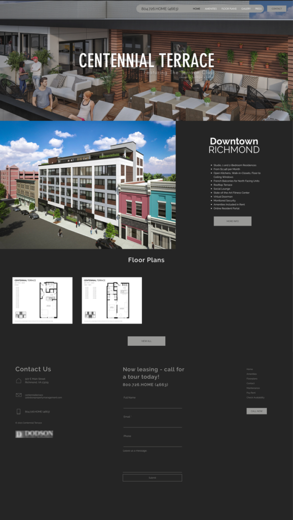
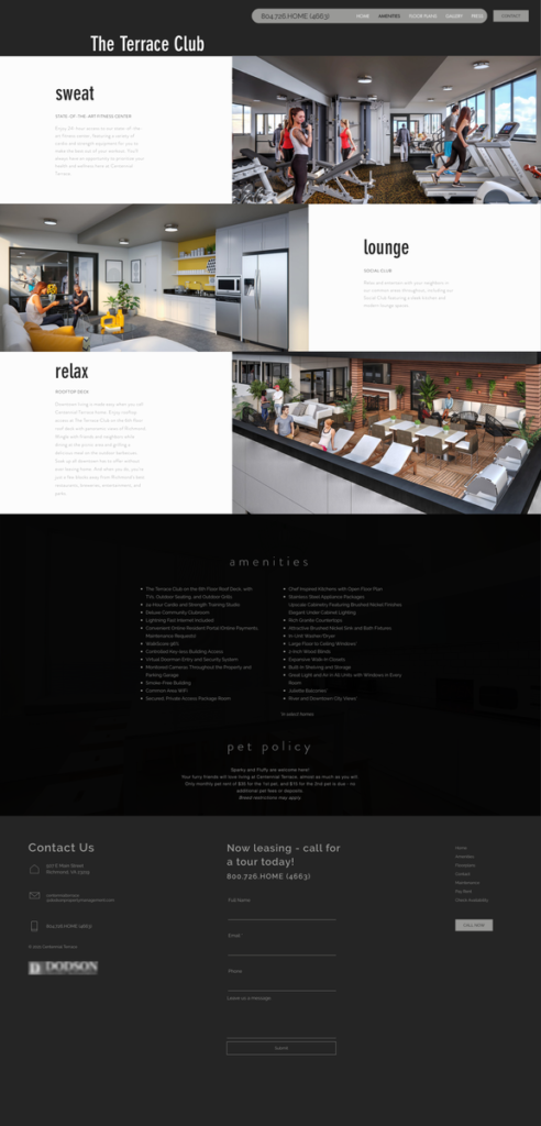
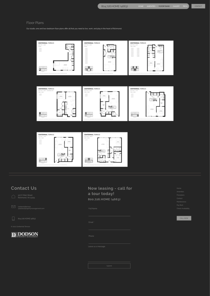
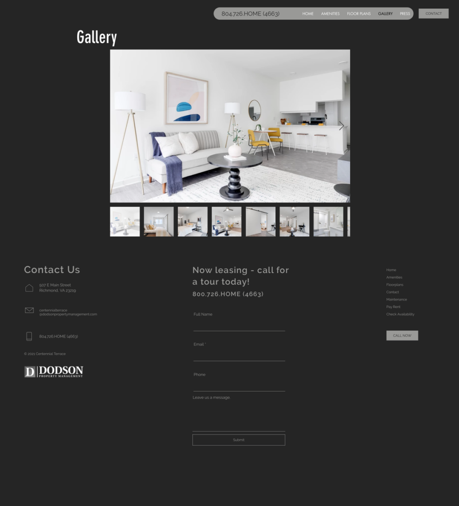
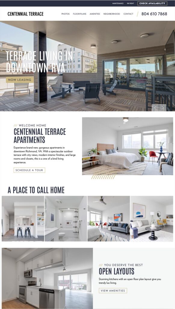
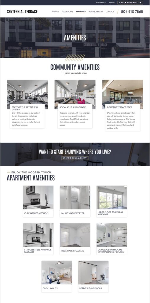
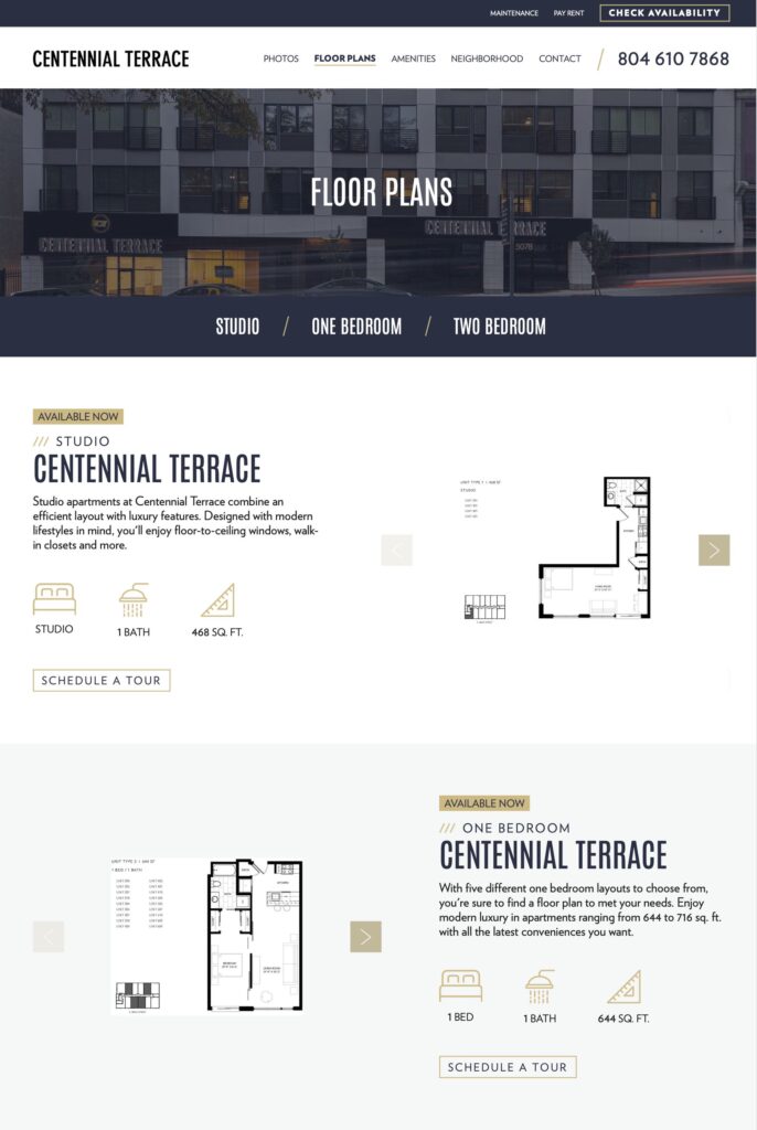
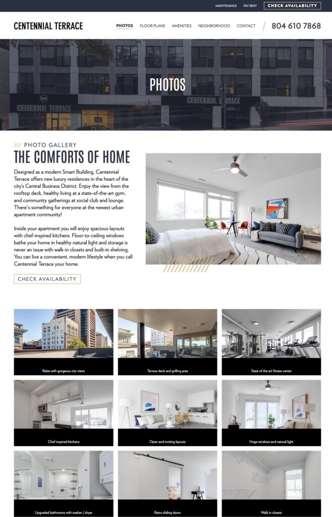
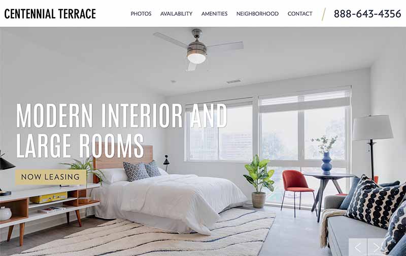
- Bigger, full-screen images to better showcase property exteriors, amenities and floor plans
- Faster loading times to improve
- Update iconography to easily convey information at a glance
- Still built with a mobile-first design to engage actively leads where they’re most likely to be searching – on their phones
Background:
The client developed a new property and needed a website fast. After using WIX to create an initial website, they realized they needed something better looking and specific for the needs of the multifamily industry. With clunky navigation and pages that weren’t uniform, this website was not reflecting the luxuries this property had to offer.
The client needed a great looking website that could help them with their apartment lease up marketing and that would continue meeting their needs once the property was up and running.
Solution:
The client approached Rentbot and we were able to create a new, modern design and launch quickly to help them gain the leases they needed. With a low-cost investment with the right professionals, they gained a stellar website presence. First impressions count the most when marketing luxury apartments, and this website delivers. Now they were ready to confidently head into the apartment lease up process!
Experience the full site: www.centennialterracerva.com
Website Before & After:
