All posts by rentbot

Rentbot’s Newest Design Helps New Luxury Apartment’s Lease Up

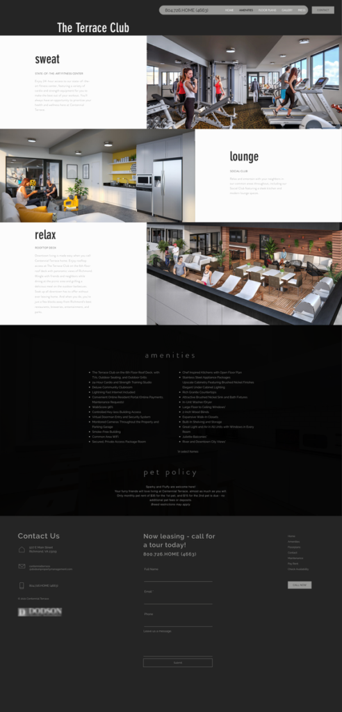
  • Bigger, full-screen images to better showcase property exteriors, amenities and floor plans
  • Faster loading times to improve 
  • Update iconography to easily convey information at a glance
  • Still built with a mobile-first design to engage actively leads where they’re most likely to be searching – on their phones

Background:

The client developed a new property and needed a website fast. After using WIX to create an initial website, they realized they needed something better looking and specific for the needs of the multifamily industry. With clunky navigation and pages that weren’t uniform, this website was not reflecting the luxuries this property had to offer.

The client needed a great looking website that could help them with their apartment lease up marketing and that would continue meeting their needs once the property was up and running.

Solution:

The client approached Rentbot and we were able to create a new, modern design and launch quickly to help them gain the leases they needed. With a low-cost investment with the right professionals, they gained a stellar website presence. First impressions count the most when marketing luxury apartments, and this website delivers. Now they were ready to confidently head into the apartment lease up process!

Experience the full site: www.centennialterracerva.com

Website Before & After:

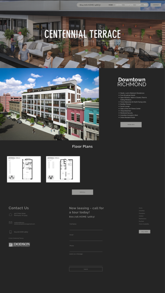
Previous Homepage
Previous Amenities Page
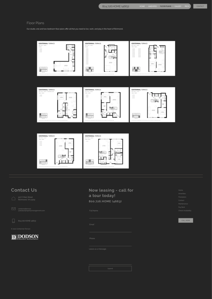
Previous Floor Plans page
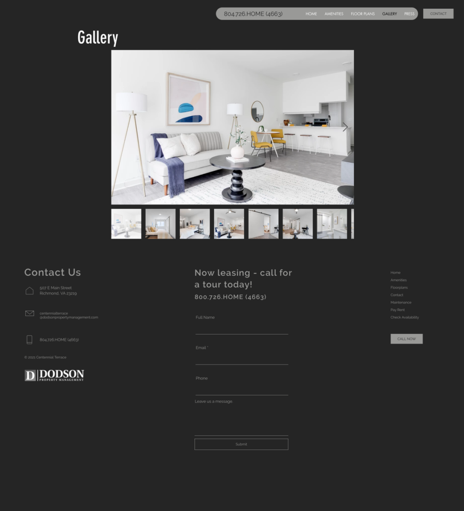
Previous Photo Gallery page
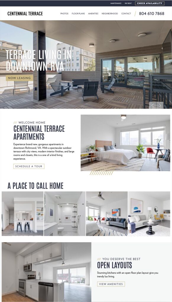
New Homepage
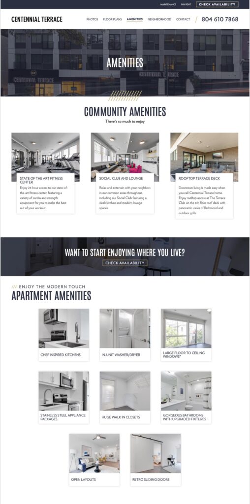
New Amenities Page
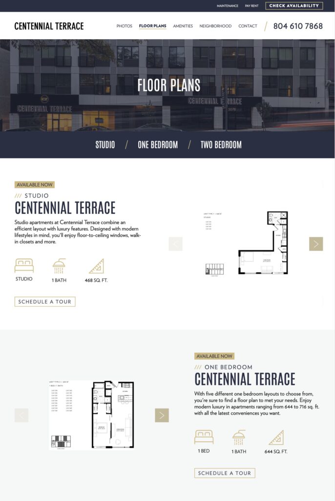
New Floor Plans page
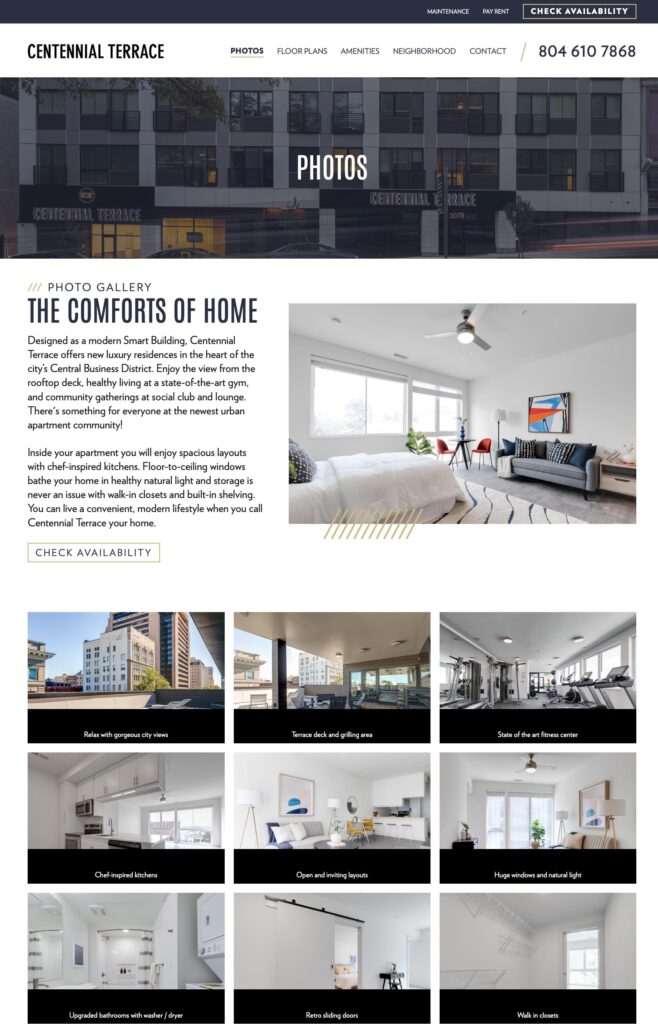
New Photo Gallery page

It’s time to get started

Similar to our yearly physicals at the doctor’s office, it’s just as important to conduct regular “check-ups” on your SEO to see how well it’s functioning. Analyzing your website and its content frequently helps you to know if you’re operating at peak performance and receptibility with your users. It will also help identify any missed opportunities as well as potential technical issues that could later result in negative impacts on your traffic and visibility. Additionally, since Google’s algorithms and web guidelines are updated quite frequently, you’ll want to ensure you remain in compliance. Not sure how to get started with your SEO audit? You can start with these four steps. Continue reading It’s time to get started

Tax-Credit Property Drives Up Leads, Conversions in the Winter Doldrums

  • 33% more website traffic
  • Averaged over 35 leads per month
  • Cost per lead under $5

Background:
The Owner/Operator in Petersburg, VA needed a new website for a 74-unit, tax-credit property. The website had to be mobile-friendly with a modern design to increase leads, and required updated photos.

Challenge:
As a tax-credit property with a lean budget, the solution had to be affordable.

Solution:
Less than a month after the client signed up, Rentbot launched the client’s new, conversion-optimized website. It featured attractive, high-definition property photos, courtesy of Rentbot after initial strategy meetings. The site also integrated with multiple existing service providers, including a resident portal.

Results:
The conversion-optimized website was launched in the dead of December 2015, when fewer people are typically searching for apartments. Even so, the new website yielded impressive results right from the start:

  • A 33% increase in website visitors and traffic month over month
  • A 6.72% conversion rate of website visitors into leads
  • An increase in leads of 290% over July 2015 and 640% over August 2015.

Over the next 3 years their website saw conversion rates of visitors into leads between 2.70% and 8.39%.

Interested? Then check out our mobile-friendly website designs to see what your new website could look like!

Richmond Portfolio Ditches ILS in Favor of SEO/Google Ads

Results Summary:

  • Click-through rates x2 over industry standard
  • 166 phone calls per month from Google Ads
  • Doubled property website traffic

Background:
This Richmond portfolio of 7 apartment complexes and townhouses (Class B/C), between 50 and 200 units each, needed better marketing with defined results. The Owner/Manager wanted more control over their marketing message with Google Ads and felt one of their Internet Listing Services (ILS) could be dropped.


Challenge:
The Owner/Manager had recently rebranded and updated their websites when they contacted Rentbot. Their current ILS that was underperforming in the exposure and leads generated, and they wanted to improve their reach with SEO & AdWords. This would eventually save money, while dramatically increasing website traffic and website-generated leads

Solutions:
1. SEO 
After performing an SEO Audit, Rentbot first made a number of structural and on-page adjustments that improved the websites’ SEO foundation.
Then Rentbot worked directly with the websites’ original developer to save the Owner/Manager time and ensure quality. The slew of changes included upgrading from HTML4 to HTML5 and improving security with SSL.
Once the websites had a firm SEO foundation, Rentbot researched neighborhood-specific keywords for each property. This SEO strategy supported the Google advertising campaigns that were set up to start driving more traffic immediately.

2. Google Ads

This client’s properties ran the gamut—apartments and townhouses, standard and tax credit, all in different neighborhoods with unique qualities and amenities. Rentbot managed the geo-targeted ad campaigns encompassing this diverse group of properties.

Results:
Within the first year of partnering with Rentbot, here’s what happened:
  • Double-digit increases in overall traffic
  • Average click-through rates (7.73%) that are double the industry standard (3.71%)
  • 1,330 total phone calls
  • Total traffic growth increased by 29% to 74% comparing year-over-year website sessions.
  • New users on the websites doubled on average when compared comparing year-over-year.
  • SEO benefits ranged from modest single digit percentage increases to 40%, 46% and 106% for one property.
Apartment Websites Suck

Apartment Websites Suck

Apartment websites suck. There, I said it, and you know it’s true. The majority of apartment websites are about as high quality as those cheap restaurant websites. You know, the ones that have a downloadable menu that won’t actually download.

Yet, just about everyone shops for their next apartment online—94% of people in fact. In an industry where more leases and lower delinquencies are by definition what keep apartment owners and managers in business, why are managers displaying their property online in the suckiest of ways?

The biggest mistake

I should start by telling you that only a few short years ago, I was a property manager. I’ve experienced first hand the mayhem that is property management: the never-ending complaints; the demands from corporate to get more leases while not spending any money; the slaving away your weekend to show units to prospects who are “just seeing what’s out there.” It’s a never-ending job with a lot of responsibilities and very few “thank-you’s.”

I think one of the biggest mistakes that apartment managers make is not allowing the property’s website to help them with all of their responsibilities. Many apartment managers find themselves making up for what their websites lack and are even embarrassed to refer prospects and residents to their property’s site.

What makes a quality apartment website?

The cold hard fact is that most apartment managers like you do not have the time or knowledge to research technology and marketing to improve your website. But, with superiors demanding more leases and fewer delinquencies, it’s time to understand just how much a good website can benefit you, your boss and your company.

Thanks to my current job at a really smart technology and website development company, I now understand what pieces and parts make for a great apartment website. Here are my top picks:

1. Large High-Definition Photos

Your current apartment website might be using pictures from the 1980’s because, well that’s all you have. But, according to research conducted by Missouri University of Science and Technology, it takes less than two tenths of a second for an online visitor to form an opinion about your brand, and your property. So, ditch the pics that look like they were taken by a flip phone, and invest in getting a professional photo shoot. It should only take about a day and a few hundred bucks. And at the end, you’ll have tons of photos that will make your property shine.

2. Real-time Availability Checking

This means that anyone on your website can check what units are actually available. They can view the floor plans, prices, and available units, and lease online if they would like. They do not have to call you to do, well, anything really, because it’s all right there online.

3. Online Rent-Payments and Maintenance Requests

Sure your current site offers, “online rent payments” but does the system actually work? Does it charge your residents outrageous fees to use? If so, most of your residents are probably still coming to the office to pay their rent, and when they do they will also be taking up your time with complaints and maintenance requests. Having a website that can do all that, and do it well, is worth it’s weight in gold.

4. Search Engine Optimization

In today’s Google-able world, if someone can’t find your property online, does it even exist? A quality apartment website will have built-in SEO architecture as well as on-page SEO optimization. This helps your visibility in a search engine’s natural or un-paid (organic) search results. It takes a professional to go into your website and make it highly searchable using a variety of common search terms that have been carefully researched..

Take it to the next level

If your current property website isn’t living up to its potential, you may want to find a better alternative. There are lots of options out there, but I’d like to suggest looking at my company’s product, Rentbot. It’s a cost-efficient way to get more leases, lower your delinquencies, and free you from the abusive relationship that is your sucky apartment website. And isn’t that just want you need?

About the author

Jacquelyn Trimper joined the Rentbot team in 2014 after surviving 4 years in property management and marketing. She loves marketing, sales, and writing to help apartment owners and property managers.
Rentbot launches new apartment website solution

It’s an exciting day! Starting today, the Rentbot platform is up and ready to accept new clients. Do you need a new apartment property website? We’re ready to shake up the industry and help you get a cutting-edge website with stunning, responsive design, online rent payments, online applications, and much more, all for a small monthly price. Contact us to get started today.